Instagram has released an update
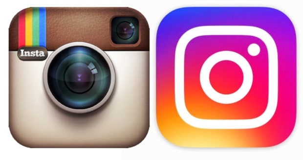
that included a complete makeover of their branding. If you haven’t seen it yet, and you have the app, give it an update. The photo-sharing app has changed its interface to a black-and-white design, but more shockingly, it has changed its classic logo!
Say goodbye to the old fashion Polaroid camera lens that we have all know and loved, and say hello to the new modern style logo. It’s more minimalistic and has a radial gradient that goes from yellow to dark blue and through the colours in between. Facebook, the company that owns Instagram, also updated the logos for a few other apps that include: Layout, Boomerang, and Hyperlapse.
Designer and Photographer of the old Logo, Cole Rise said: “I’m super psyched on the new one, I love the minimalism. Regardless of the colors behind it, the white shape, the actual bones of the new symbol itself , It’s beautiful, and I think that can persist over time.” Clearly there is no love lost from having his old design tossed aside, which is not surprising seeing as he’s is still a friend with his former colleagues and to both of Instagram’s founders.
I am personally not sure I am a fan of the new logo, nor do I think it was a smart move completely overhauling its entire brand to something completely the opposite from what it was. I think it is too much of a drastic change from its classic, and nostalgic look that their previous iconic logo had. I think for a brand this big it would have been smarter to have a more subtle evolution in its branding. Changing so drastically destroys all their recognition power that they worked so hard to build behind its previous logo.
What do you think?

